- The "Online Communities Map," courtesy of XKCD, is no longer accurate. To be fair, it's now almost 3 years old -- practically a century of Internet time.
- Replace that big territory of "MySpace" with "Facebook," and it's nearly updated.

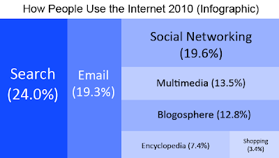
- This blue-and-white infographic is more boring, but more recent, and thus more accurate. However, it doesn't give us which particular websites are being used.
- But read in relation to the "Online Communities Map," we can see that xkcd.com is still more or less on the right track -- the proportions of the "landmasses" still concur with the latest data as seen here in the infographic.
- A "landmass" of users the size of Russia and China, use the web for social networking sites like Facebook, MySpace, Multiply, and the whole lot.
- But I have to agree with the infographic that a larger percentage of net users use the same for simple search tasks. Movie schedules, addresses of establishments, full texts of court cases, you name it.
- IMHO, the web is more useful and actually used more that way. And along these lines, various companies are beginning to make their forays into augmented reality.
- So, back to the "Online Communities Map," Google, Wolfram, and other search engines would occupy a large part of the oceans.
Keeping it that way for another 40 years is another issue altogether.

No comments:
Post a Comment